
Project Overview
Shopaztecs.com is a service provided by the SDSU Bookstore. The website focus on selling SDSU apparel, merchandise, and gifts. They wanted to have their website redesign, making it more appealing and modern. Their products focus on helping users who want to purchase SDSU apparel, merchandise, and gifts online and to provide them a great shopping experience.
Role: UI & UX Designer, Web Developer
Methods: Research, Journey Mapping, Solution Sketching, Wireframing, UI Design, Development
Tools: Design: Adobe Illustrator, Adobe XD | Development: ASP.NET MVC, C#, JavaScript, HTML, CSS
E-Commerce Platform: ASPDotnetstorefront
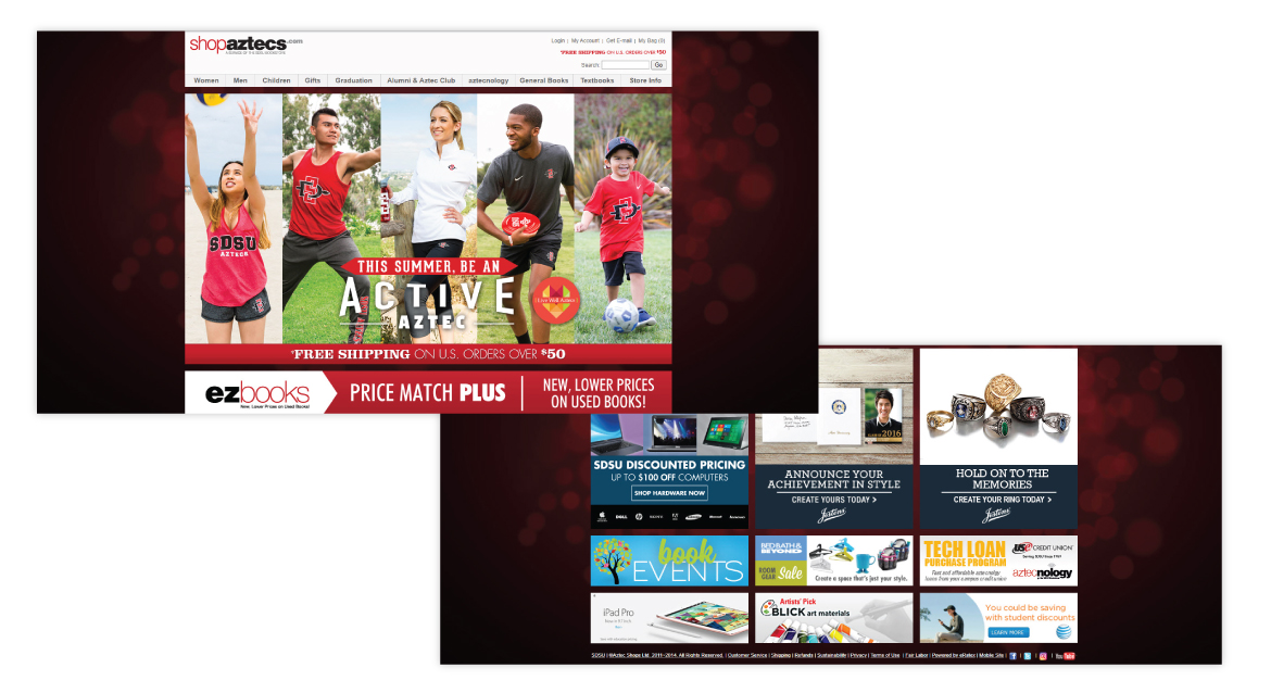
Previous Website
The Problem
How can we make our website gain more traffic and increase sale?
Our users want the best shopping experience online. They want to be able to find what they want on the website and have the best checkout experience.
The Goal
Our goal was to redesign the website to make it more modern, easier to navigate, and provide a better checkout experience.
Understanding the User
User Research: Summary
In my research, I conducted interviews with our users to ask about their experience with online shopping. Many of our interviews were done in-house and around campus. The feedback received through research made it very clear that users have different experiences depending on their age. The most common responses were that many websites do not have a clear structure of navigation, it is hard to find items and content was overwhelming.
User Pain Points
Experience
Online shopping websites don’t provide an engaging browsing experience
Navigation
Website designs are often busy, which results in confusing navigation
Interaction
Small buttons on websites make item selection difficult, which sometimes leads users to make mistakes
Persona & Problem Statement

User Journey Map

Design Process
Sitemap
Difficulty with website navigation was a primary pain point for users, so I used that knowledge to create a sitemap. My goal here was to make strategic information architecture decisions that would improve overall website navigation. The structure I chose was designed to make things simple and easy.

Solution Sketching
Next, I sketched out paper wireframes for each page of the website, keeping the user pain points about experience, navigation, and interaction in mind. The home screen paper wireframe variations below focus on optimizing the browsing experience for users.

Lofi Wireframes
Moving from paper to digital wireframes made it easy to understand how the redesign could help address user pain points and improve the user experience. Prioritizing visual element placement, clear navigation structure and useful buttons for interactions was a key part of my strategy.

Usability Study Findings
1. Featured Items
Users want to access new and popular items on the home page
2. Sort By Filter
Users were not able to sort items by filters, such as lowest to highest price or most popular
3. Checkout
During the checkout process, there was a confusion on how to select credit card as a payment option and applying split tender with a gift card
Refining The Design
Accessibility Considerations
Color Contrast
Color palette is maintained contrasts ratio as per wcag 2.0
Alternate Text
Description for images provided for the screen reader
Keyboard Navigation
Users can interact with our website using keyboard alone
Hifi Wireframes
As I was developing the hi-fi wireframes, I wanted to focus on accessibility and usability. Below is the sign-up screen that I want to use for an example.
-
I used icons and color to show users whether their tasks were successful.
-
I also used indicators to help users identify their place on the screen.
-
Finally, to increase transparency, I added support text underneath specific fields to let the user know what qualifies for their input.

Screen Size Variations

Style Guide

Final Product


Going Forward
Takeaways
Impact
Our target users shared that the design is intuitive and the shopping experience is more enjoyable.
What I learned
I learned that usability studies and peer feedback influenced each iteration of the website design. There will always be changes to the design of the site and you cannot please everyone in the process.
Next Steps
1. Testing
Conduct follow-up usability testing on the new website and validate the user pain points have been addressed.
2. Improvements
Identify any additional areas that need improvement and add new features.